Album Covers
Wednesday 22 March 2017
Friday 10 March 2017
Monday 6 March 2017
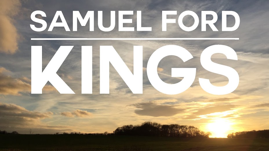
Final font choice for printed productions
My final font choice, that i will use for all the text on my print productions is 'Couture' by Chase Babb


There are several reasons for this choice. For one, it acts as a bold, impacting font that reflects the rounded and organic nature of the genre of our chosen artist. In terms of practicality, the thickness of the letters are suitable for my digipak design as they will act as good, large enough, windows through to my front panel. When cut out, the audience will easily be able to see through to the sunset behind. If i chose a thin font, perhaps a serif one, it may be difficult to see through to the actual album artwork. In addition, when it comes to construction, having bold, sans-serif, letters will be easier to cut out.

There are several reasons for this choice. For one, it acts as a bold, impacting font that reflects the rounded and organic nature of the genre of our chosen artist. In terms of practicality, the thickness of the letters are suitable for my digipak design as they will act as good, large enough, windows through to my front panel. When cut out, the audience will easily be able to see through to the sunset behind. If i chose a thin font, perhaps a serif one, it may be difficult to see through to the actual album artwork. In addition, when it comes to construction, having bold, sans-serif, letters will be easier to cut out.
Wednesday 1 March 2017


Subscribe to:
Posts (Atom)